We caught up with the product and design team at Rocketspark to see what they think the upcoming website design trends are for this year. We discussed eight upcoming web design trends for you to keep an eye out for heading into the year.
1. 80’s and 90’s inspired serif fonts
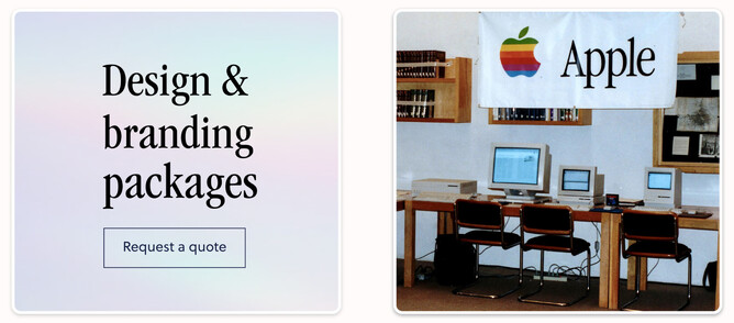
For the first trend, we’ve gone for a bit of a walk down memory lane to the nineties. Serif fonts inspired by 80’s and 90’s poster design have been popping up more frequently and we’re not mad about it! The world has seen lots of uncertainty over the past few years, so there is no surprise that these nostalgic fonts are making their way back. We’re not talking about tacky neon encrusted 80’s retro-futuristic fonts here but elegant and professional serif’s with a touch of retro vibe.
2. Walking through the archway
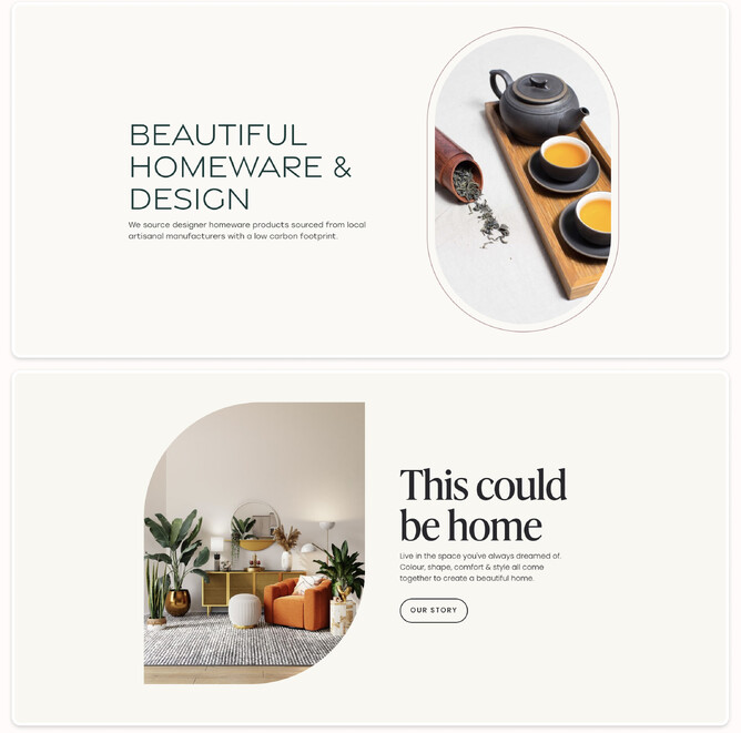
We all know and love the archway trend, 2022 really saw this one take off. At risk of becoming overdone, we’re seeing more designers mixing things up a bit on this concept to capture a similar feel that’s a little less predictable. On masked image frames, single corners are curved, upside down archways, single curved corner boxes and all corners curved to form a capsule looking shape are picking up steam—but also combining multiple variations of this in the same design.
3. Layering text and design elements
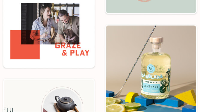
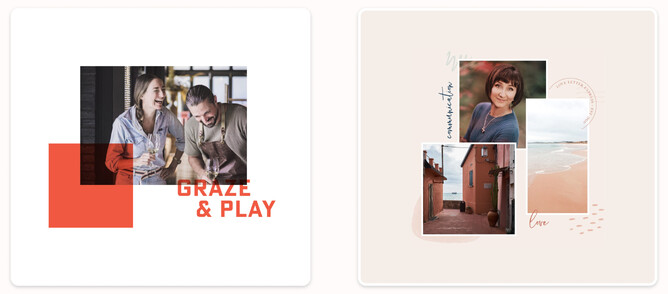
Layering is a good technique to show flow and connection throughout a website. Layers are great for encouraging your website visitor to keep scrolling down the page and show the linkage between different stacks on your website. By overlapping elements the eye is drawn to those elements. We love clean and well spaced web design, but unless your images are world-class and you’re typesetting like a boss, the risk of a snoozefest is there. Overlapping elements break the mould a little and literally colour outside the lines to create intentional areas of visual interest in the design. Overlapping elements also shows that they’re connected visually.
4. Page speed
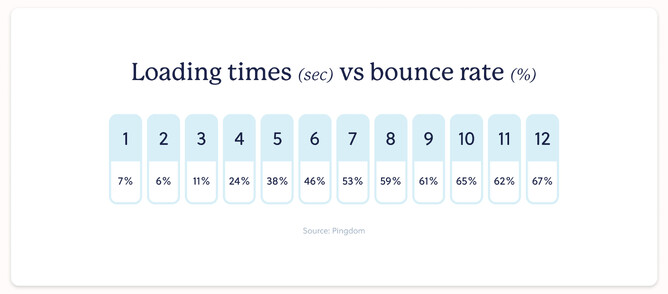
We’ve taken a different approach to this one, but something that is important nonetheless, is page experience for website visitors. Google’s core web vitals around page experience now affects search rankings. Why have they done this? A fast loading website is more effective at engaging visitors, which makes your website more effective. Pay attention to mobile pagespeed, where users may be on slower 4G internet speeds. One way to do this is to simplify the mobile experience. If you’ve got large decorative background images on the desktop version of the website, are they adding much value to the mobile design or by removing them are the pagespeed gains a higher priority? More content to come on this topic…
5. Handcrafted illustrations and backgrounds
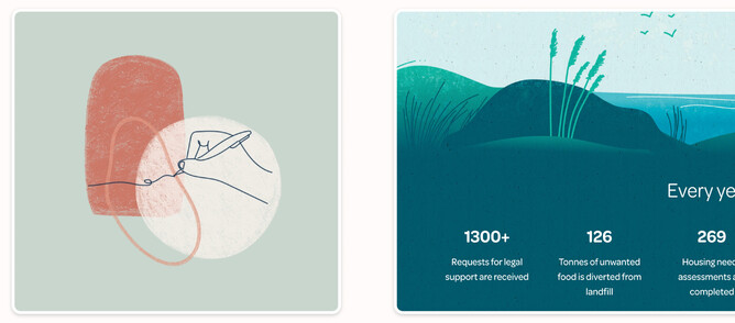
Handcrafted backgrounds and illustrations add a bespoke feel to the page that elevates the design, to align strongly with the brand style and colours. These illustrations promote visual interest throughout the design and differentiate a website from off the shelf icons and illustrations that have a “seen it somewhere else” feel about them. Hand crafted visual elements also help to re-introduce a ‘human’ aspect to a website design. Websites can often become overwhelmed with a digital only feel, but when adding different mediums, such as hand drawn icons and illustrations that show texture, it can help make a website feel more personalised and approachable.
6. Lined grid layouts
Geometric line grid layouts serve as a multi purpose design element. They visually create a structured appearance on website design which adds a level of formality and elegance, but also on a functional level they can help make navigation clearer between sections of content. Thin borders can add sophistication to a design where thicker borders create boldness and a heavier constructive feel. Both desktop and mobile can both benefit from these layouts, as it can help unify sections of content together.
7. Big type display headings
First impressions are key with web design. Research shows that it takes about 50 milliseconds (0.05 seconds) for website visitors to form an opinion that determines whether they will stay or leave your website. Big type display headings allow users to read what you’re all about quickly and helps provide a good first impression. Large display headings also force you to be clear and concise with the message which is always a great thing for your visitors.
8. Studio staged product photography
We are living in a golden age of staged product photography as props, small backdrops and lighting setups are now so affordable and accessible to photographers. Hero product photography shots of some featured products are a visual treat for visitors when they arrive at a website, whether you’re showcasing a range or an individual product. By selecting props or backdrops that align with your brand colour and style you can achieve a highly art directed first impression.
It’s definitely worth convincing your client to invest in professional photography as it will pay dividends in the long run. Having stunning photography will make your job as a graphic designer so much easier with great images. If you’re working with poor images, it will take a lot longer and drag your portfolio down. Not ideal!
2023 web design trends
There you have it! Here is our take on the top website design trends that we think we will see heading into 2023. I look forward to reporting back in a year’s time and seeing if we were right on the money!
