Colour is one of the most significant drivers of first impressions, so it’s important to get it right for your website design. You’re not designing the website for you or your client, you’re designing the website for the Persona you’ve identified earlier with the client. Is your colour palette going to appeal to this persona? How do you want the website to feel? Calm? Luxurious? Exciting? Formal? Fun? This article covers off some key aspects of using colour in web design.
Colour balance through the page — complementary, not repetitive
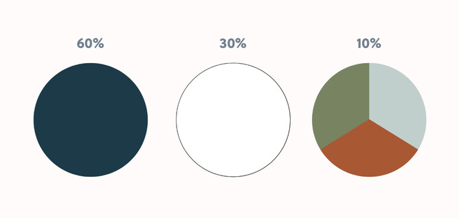
Colour should be considered not as disparate elements but how does the overall page feel top to bottom. As a general rule, the 60/30/10 rule from interior design can be helpful. 60% your main colour, 30% secondary colours, 10% accent. Although if your accent is particularly bold (maybe a very vivid colour in the client’s branding, a more muted supporting palette could be called for to balance it out).
Think about the dynamics of colour as you scroll through the sections of the page and pay particular note to background colours. Too much of the same colour background can feel like a song that repeats the chorus 5 times. Taking that musical analogy further, repeating the verse and chorus over and over usually results in a boring song. A great song will take the listener to another place, whether it be a bridge, an elevated version of the chorus. A great web page will do the same.
The law of common region states that: “Elements tend to be perceived into groups if they are sharing an area with a clearly defined boundary”. By defining variable backgrounds for different sections of the page, you communicate visually to the visitor that that section of content belongs together and when the background changes, you’ve moved to a new section.
Sometimes across multiple related sections you may utilise the same colour background along with layout and illustration techniques to create flow between those sections, where a change in background could make them feel disconnected. This technique is called the law of uniform connectedness: “Elements that are visually connected are perceived as more related than elements with no connection.” The website Laws of UX explains this to: “Group functions of a similar nature so they are visually connected via colours, lines, frames, or other shapes.” This is where accent colours and illustrated elements can create a visual connection between related content that isn’t necessarily grouped close together but is nearby (adjacent vertical sections for example).
Buttons
Bright saturated colours can be effective for buttons, as it will draw attention to the button.
https://uxmovement.com/content/why-you-should-avoid-bright-saturated-background-colors/
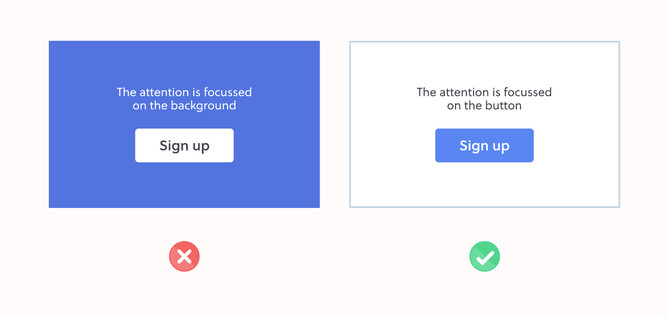
However, if clicking call to action buttons isn’t critical to the visitors experience of your website and you don’t want them to be an overly weighted visual distraction, you could make them more subtle as per the examples in the diagram below.
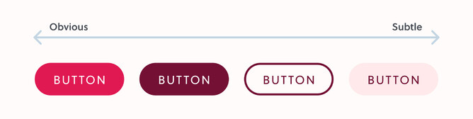
Additionally, you could develop a button look for highly important actions you want the user to take and a more subtle button look for buttons that are supplementary actions.
Buttons are an important one to consider contrast for visually impaired visitors as per accessibility contrast guidelines.
Another subtle technique to make a design feel more luxurious is to slightly adjust the text colour to reference or contrast the button background colour. In the examples above, rather than using harsh white for the button text on the left two options, they use a bright but low saturation pink that feels more crafted than just using white. You could also choose a text colour of a different hue like a very light pastel pink for the text on a dark low saturation forest green button background.
Headings & paragraphs
It’s important to distinguish headings separately from paragraphs as most web visitors like to scan a page looking for relevant headings before drilling deeper into the paragraph content. This can be achieved with a combination of size, font weight and colour.
We’ll talk more about font weight and size later in this module but headings can incorporate some of the brand colour into them, so long as two things are balanced and taken into account:
- Make sure your headings have enough contrast against the background.
- They’re not pure black #000000 text on white.
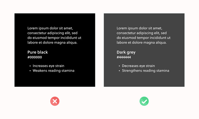
- They’re not pure white #ffffff on a dark background.
One research study found that: “black text on a white background over stimulates the OFF ganglion cells while white text on black background over stimulates the ON ganglion cells.” This finding means that “white text from a black screen could inhibit myopia, while black text on white background may stimulate myopia.” The study advises against reading black text on a white background due to the striking effects of contrast polarity.
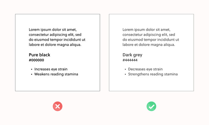
https://uxmovement.com/content/why-you-should-never-use-pure-black-for-text-or-backgrounds/
Similarly, white text (#ffffff) on a pure black background (#000000) is harder on the eye, particularly so for people with astigmatism:
“This makes eyes work harder and open wider since it needs to absorb more light. When this occurs, the white letters can bleed into the black background and cause the text to blur. This effect is known as “halation” and it affects users with astigmatism, which people of all ages could have.”
https://uxmovement.com/content/why-you-should-never-use-pure-black-for-text-or-backgrounds/
https://uxmovement.com/content/why-you-should-never-use-pure-black-for-text-or-backgrounds/
Additionally, headings should be more prominent than the paragraph text themselves. This could be achieved by making both the same colour and the headings are larger and/or a different typeface or it could be achieved by making the heading a higher contrast than the paragraph. Even if still a grayscale colour, a darker grey for a heading will make it more prominent than the paragraph text. This is all about balance and finding a comfortable contrast between the heading and the paragraph.
Content backgrounds
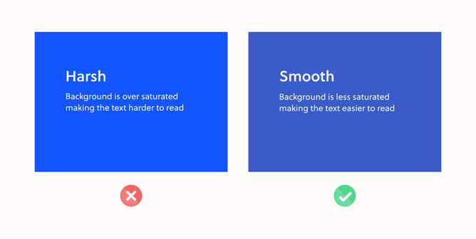
Don’t use bright saturated backgrounds
Two other studies referenced in the above article found that “bright, saturated colours have links to high arousal. Hue also affects arousal, but saturation and brightness have a more significant impact”. What this means for backgrounds is that a bright, highly saturated background will distract the eye away from the content, buttons etc. So backgrounds shouldn’t be bright and saturated unless the background itself is the focal point.
Use dark backgrounds sparingly
Research cited by NN Group shows that text on a dark background is less efficient for most users to read: “Their results showed that light mode won across all dimensions: irrespective of age, the positive contrast polarity was better for both visual-acuity tasks and for proofreading tasks”.
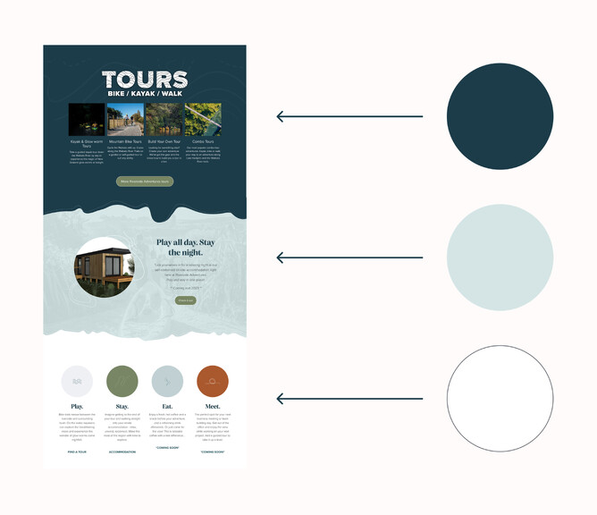
A dark background can also feel ominous or serious. This may suit the look you’re after but you can achieve the effect of a dark background without the entire page or website being dark. In this example below designed by Natalie White from Magic Fingers, she contrasts the top section of the page with a teal hued navy blue background but transitions to a pastel duck egg blue before transitioning to white. The dark colour feels appropriate for a tourism operator that conducts after dark kayaking tours to view glow worms but finishing the page with a more calming white background feels less intense than an all dark page. By transitioning to white via a pastel colour it reduces the harshness of that transition.
Icons/foreground illustrations
Icons and foreground illustrations are about drawing the eye to important visuals that then draw attention to text content by the law of proximity: “Objects that are near, or proximate to each other, tend to be grouped together.” So while the text itself may not be eye catching, the illustrated element is. A group of icons in a grid also benefit from the law of uniform connectedness mentioned earlier. If each icon exhibits the same illustration style, line thickness, colour palette, the eye understands that they are grouped points—like a much more visually interesting bullet list.
These kinds of graphical attractors can utilise higher arousal colours so long as not overused to draw attention to the content.
Background graphics/illustrations
Background graphics and illustrations shouldn’t distract from the foreground content. They are there to add feeling and mood to a design but shouldn’t be the focal point. As a result, using less saturated colours can be a way to blend these into the background and create depth. If you want a section with high visual arousal, why not make the background the focal point? This may be an illustrated section for effect or a full window width photo background.
Header colouring
Just as with any background colour, the header background shouldn’t be overly bright and saturated. The colour of the header area also says a lot about the first impression of the website. A dark header with a defined bottom edge is strong and powerful (or with the right supporting colours and typography could feel luxurious). A light header feels much more relaxed by contrast. Then there are a range of pastels and slightly desaturated colour hues that can bring the brand colours into the header, so long as the brand itself is contrasted enough against the background.
Another option for headers is to make them transparent with no defined bottom edge to reveal photographic, illustrated or just solid colour backgrounds. With plenty of space between the header logo/menu and the first content, this can be a way to make the branding and menu feel related and relevant to the first section of content without a harsh bottom edge to the header and is a popular look that can be adapted to a range of scenarios.
Summary
Effectively using a chosen colour palette plays a massive part on the overall aesthetic and effectiveness of a website. Colour is not only used to help bring a website to life, it also provides visual breaks between sections, adds emphasis to chosen areas and also helps set a mood / theme of a website. Following these effective techniques throughout this article can greatly improve the functionality and engagement on a website design.
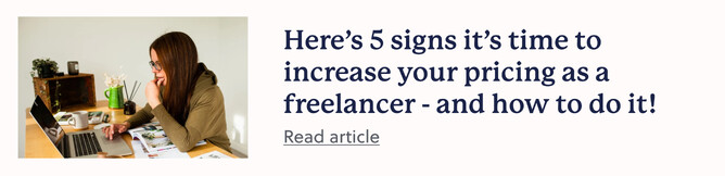
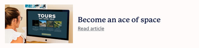
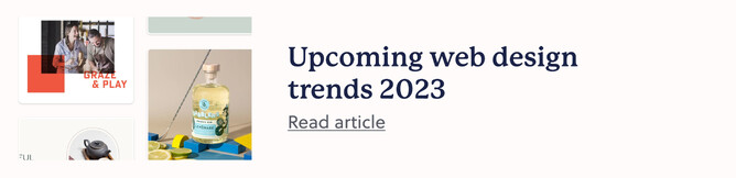
Discover more: