If your background is in print graphic design & branding, you're likely familiar with designing fixed size collateral like business cards, a DLE flyer or a magazine cover. This is a key difference with web design — the width is flexi and the height is scrollable. If you pack content tightly together in the centre of the page like you might on a flyer, leaving lots of space down the sides of the page, this creates a sort of narrow tower of content on the page that feels outdated and doesn’t maximise the full potential of the page. So while spacing is great, where you put the spacing and how you size your content within your total available space is important. This article covers off some best practice ways of effectively spacing content on a website.
Spacing between related objects
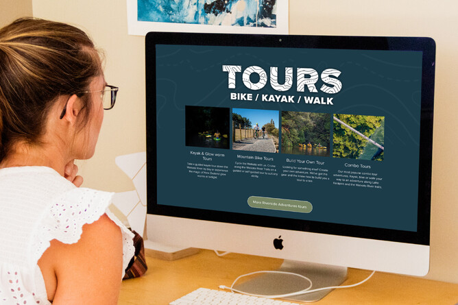
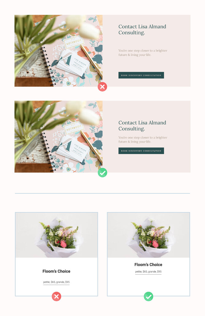
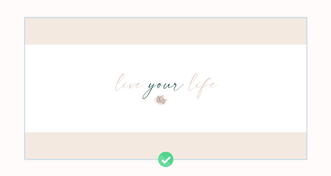
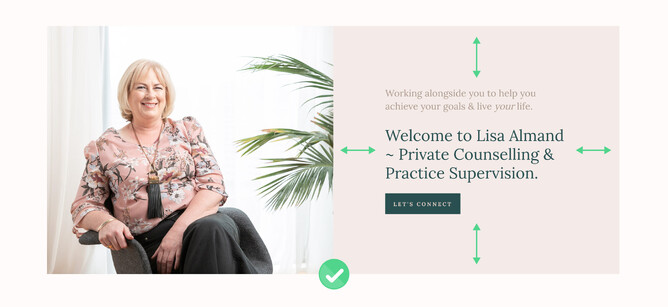
When you’re wanting to display a connection between two closely related elements, this is one of the few scenarios where being less aggressive with space is important. For example, a heading, paragraph and button that relate to each other or a category photo button with text subtitle below the image.
Spacing around grouped elements or between columns that contain text
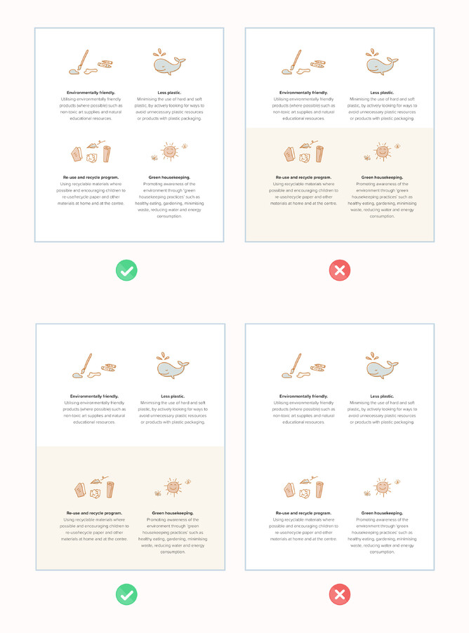
Grouped elements that contain text need breathing room around them on all sides. This is because:
Even if we keep our rags relatively tidy, if the elements to the right of the rag feel too close, it accentuates the rag whereas space disguises the rag.
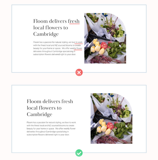
So if we add extra space to the right of the rag, we need to balance that with space to the left of the margin/column. With left aligned text, the spacing on the left doesn’t necessarily have to be the same as the spacing on the right— the text block could be slightly left of page centre to accentuate the left aligned balance of the text, rather than trying to make left aligned text feel centred (or worse feel like centering the text is the best way to go).
Whitespace allows the eye to focus on one thing without competing elements, improving readability.
Placing items too close to each other competes because of the law of proximity where “Objects that are near, or proximate to each other, tend to be grouped together.” The eye starts to perceive them as part of the same focus and struggles to differentiate between them. Hicks Law is also at play here, where “The time it takes to make a decision increases with the number and complexity of choices”.
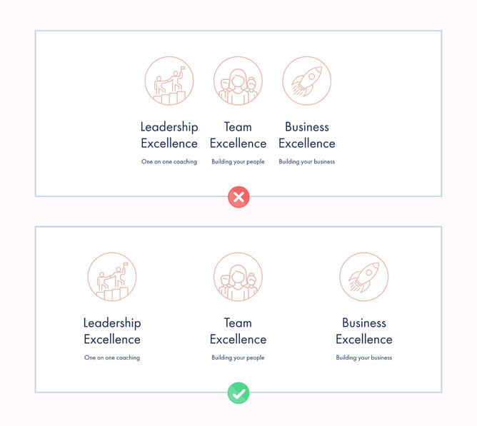
Text inside a common region without enough space above and below tends to take on an effect of the content being squeezed between a vice, increasing distraction from content in sections above and below it.
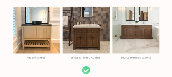
Spacing between rectangular images
These rules don’t have to apply when it comes to spacing between rectangular images of the same width and height. Rectangular images of the same shape and size can work next to each other with little or no spacing—because of their straight edges and clean lines. This is called the law of similarity, where “The human eye tends to perceive similar elements in a design as a complete picture, shape, or group, even if those elements are separated.” So whether your grid of image buttons has 2px gap or 40px gap has very little to do with usability and more just comes down to stylistic preference for the particular site.
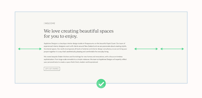
Spacing to balance the full width of the page
A website is a little like a scrolling billboard. A billboard is about maximising visual impact and maximum readability, which minimises overuse of small text. If you want to utilise more of the page width you may need to increase the size of your headings and paragraphs beyond what you’re used to and proportionally increase spacing around the elements so this larger type doesn’t feel crammed into it’s space.
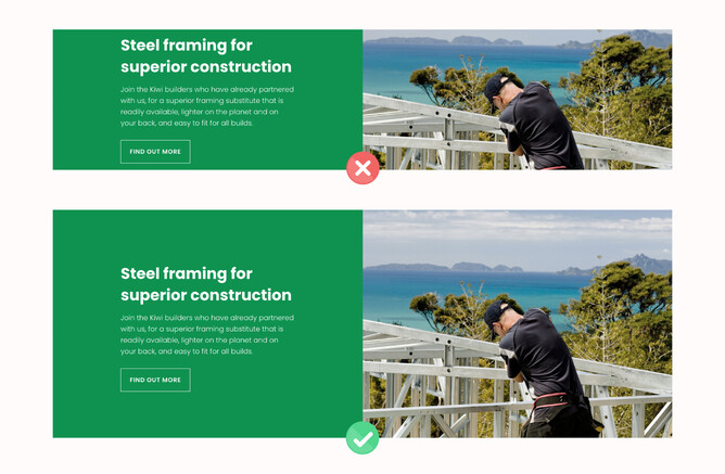
Vertical spacing between sections
Vertical spacing between sections should vary relative to the contrast in backgrounds. If two sections have the same background, the combined spacing of each section adds up to quite a large overall gap whereas if two stacks have contrasting backgrounds, there is a dividing line in the middle of the gap that appears to halve the height of it. In this context you might need more breathing room around the content.
Variation in layouts & spacing
Having too many similar layouts in your design will feel boring and document-like. An effective website is consistent in feel but varied in layout to drive interest as visitors scroll down the page.
Summary
Spacing content effectively on a website is as equally important as the content itself. If the content is not presented in a functional and desirable way that makes the users experience easy and effortless to navigate through, you run the risk of the user not engaging with your website. Following these simple layout techniques throughout this article can greatly improve the functionality and engagement on a website design.
Discover more: