Humans are meaning-makers. We are constantly seeking for a reason, a connection or a relation to the world around us. User Experience (UX) Design understands this principle intimately, it’s job is to marry design principles, brand and the course of the user journey to create a particular feeling when a customer uses a website.

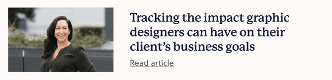
Tonia Reid, Creative Director of Greenhouse Creative is a huge advocate for UX Design. She believes that the best design work will always consider how the user feels when interacting with that service, product or of course webpage. “I naturally look at it from a brand perspective, and what user experience does to either enhance or work against the feelings that we're trying to get a customer to feel when they experience a brand,” she says.
Essentially, UX principles should be applied in conjunction with graphic design work for the best client outcomes. You may be wondering what UX design actually is. Multiple facets target user experience in different ways. Let’s explore those:

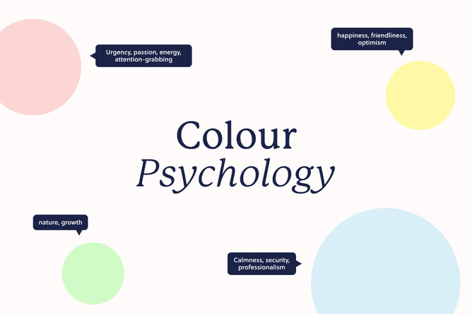
Chances are you’ve probably heard of colour psychology - how different colours evoke differing emotional responses in people. For instance, blue is associated with calmness, security and professionalism. Red is known for urgency, passion and energy - and of course, attention-grabbing. Green generates responses associated with nature and often growth - you will see this colour often used by eco and health brands. Yellow is the happiness colour, conveying a sense of friendliness and optimism.
When Tonia uses colour psychology she always asks herself “How do we want to make people seeing the brand feel? Do we want them to feel calm and safe? If we use soft colours, it can be kinder, and the way that it speaks. You can use different colours, but use them intentionally, don't use them just because you can without considering how it could make people feel.”
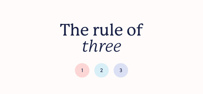
The rule of three is another core tenant of good UX design for Tonia - be that having three options in a menu bar, three dominant colours of a website, three sections or three sections to a segment. Why? As Tonia explains, it is generally accepted that websites have three distinctive groups of customers coming to them – wanting different things. Direct b2b customers, the general public and those searching for a niche service or product offering. “When these groups land on your homepage, you want to make sure that all three of them immediately know that they're in the right place for them.”
Tonia also highlights the importance of engaging in extensive questioning to understand your client's goals and motivations. By diving deep into the "why" behind design decisions, you can align your work with the client's vision. This understanding enables designers to create a user experience that resonates with the target audience, addresses their pain points, and guides them towards the desired actions. Big picture questions are just as important as the pedantic design points too, Tonia points out. “Think about where that customer is coming from. What is the journey that they've taken that's led them here and how they're going to be feeling? And how can we solve their problem quickly and effectively for them?”
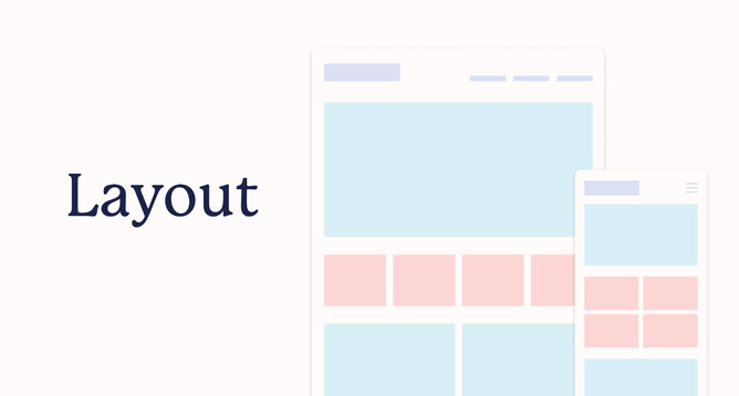
Layout is critical to UX design. As Tonia explains “People need guidance, they don't know the website, they need to be guided through and then the colours, design and layout can help with that.” She recently refreshed a client's website layout to create a better click-through experience for users with great results. The branding, logos and colours stayed the same, yet simply reorganising the website flow, menus and categories generated a significant boost in sales. “The week the refreshed website went live, we sold as much as we'd sold in the prior month. Literally four times the amount of sales just by changing the front end design so that the user experience was different.”
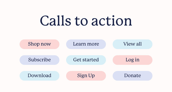
Guiding users through clear calls to action are also critical to a good user journey. Tonia notes that you want to make the next steps apparent to every user. Doing this is achieved by placing clear and concise calls to action on every page, that direct users towards relevant information, products, or actions. “You should have a call to action on every page.” The hierarchy of content plays a vital role in presenting essential information upfront while providing more details further down the page for those interested in further exploration.
Tonia’s last nugget of gold when it comes to UX design, is remembering to avoid overwhelming users with excessive noise, distractions, or unnecessary elements. Websites should allow users to concentrate on the desired actions and information. Thoughtful use of animations, colours, and typography should align with the brand strategy and desired user emotions, contributing to a harmonious and engaging user experience.
Discover more